How It All Began
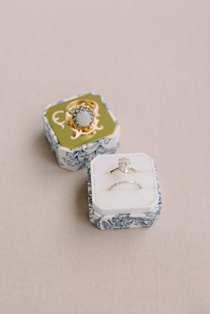
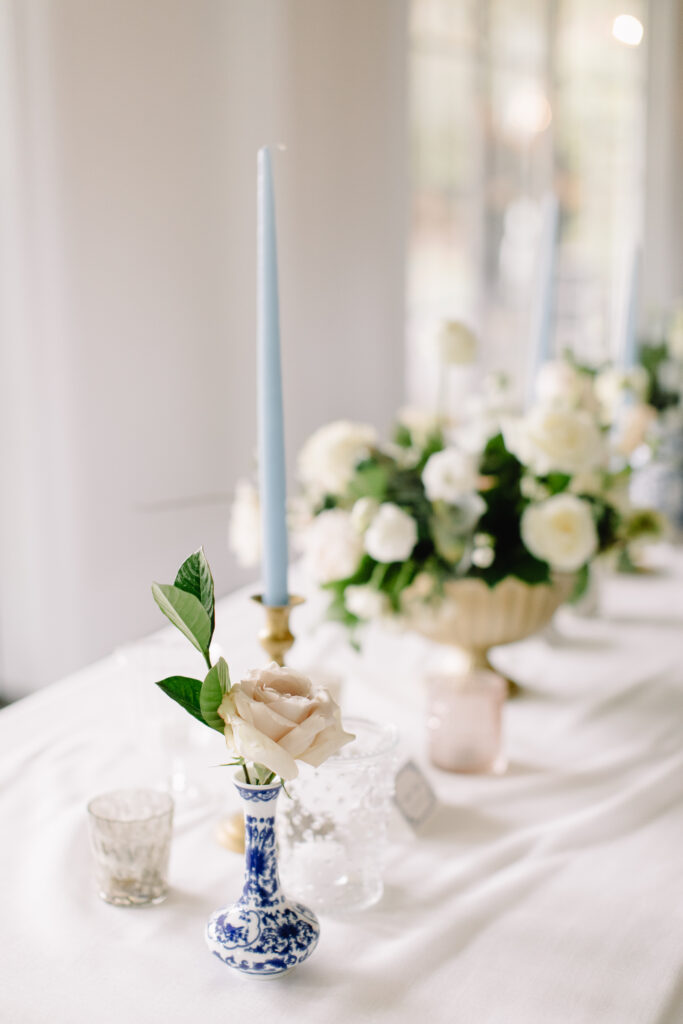
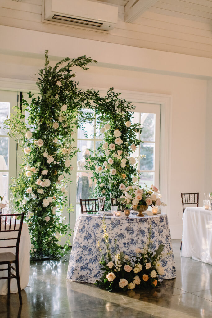
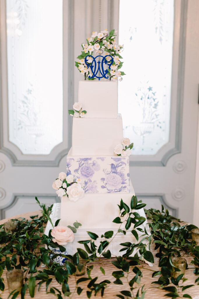
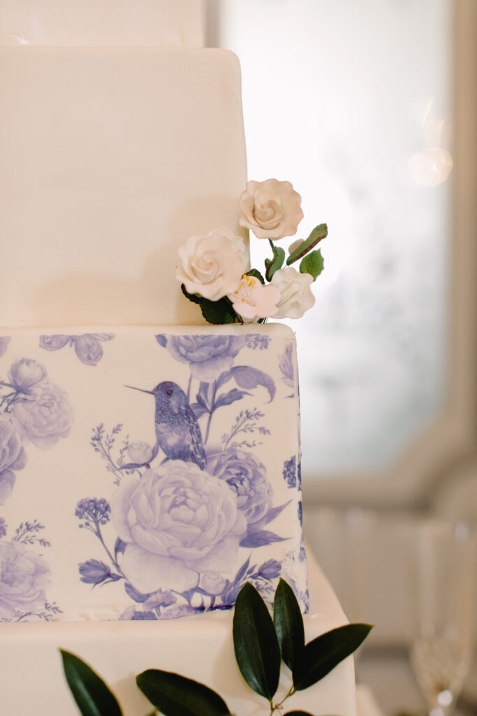
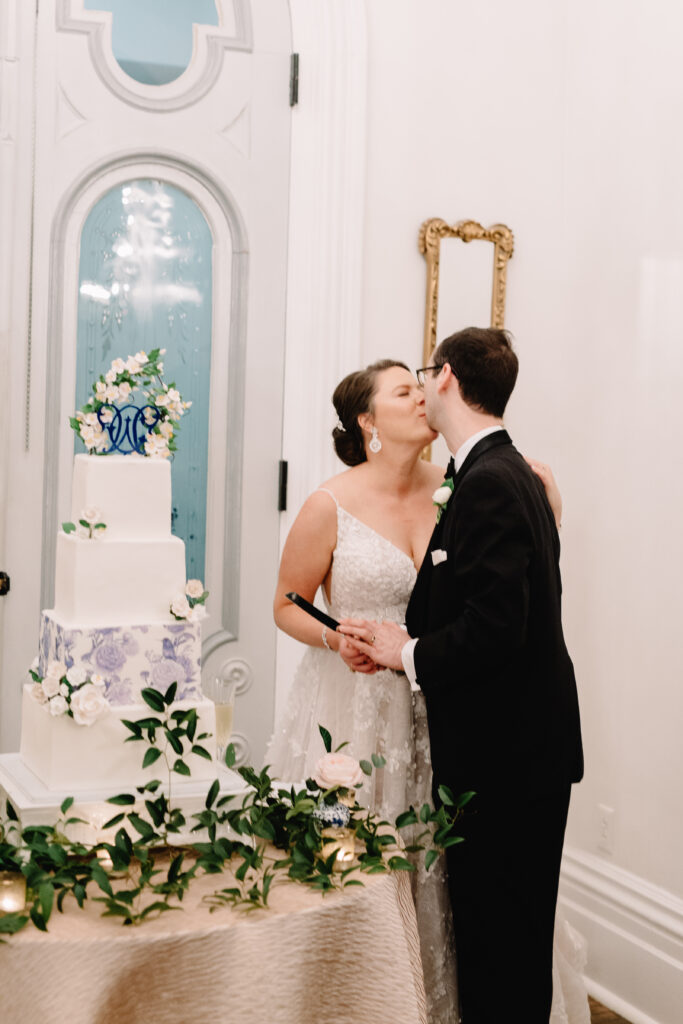
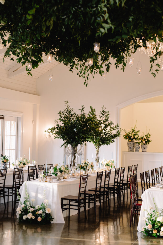
Sometimes you get to work with a client whose design vibe and taste clicks with yours in every single way. Caroline’s vision for her blue and white grandmillenial wedding at Merrimon-Wynne in Raleigh, NC did just that! While working with C&D Collective, Caroline reached out to discuss creating custom wedding invitations. She knew she wanted blue and white accents and a grandmillenial chinoiserie vibe. In addition, she desired that her vision would mesh beautifully with her florals from Meristem Floral.
Together we dreamed up some incredible ways to highlight her and Will’s love story and craft beautiful handmade pieces throughout. In this post, I want to give a behind the scenes look at the overall process of working with Caroline for her blue and white grandmillenial wedding. Want to see how we created several ways to showcase her custom watercolor artwork and brand her wedding day? Keep reading for all the details.
Before the Wedding: From Blue and White Inspiration to Real Design Concepts
The C+D team crafted a stunning vision from the very beginning for the theme of Caroline and Will’s day. Take a peek at the mood board they curated below! You’ll see the color palette and a few images that Caroline really gravitated towards encapsulating her vision for the day.
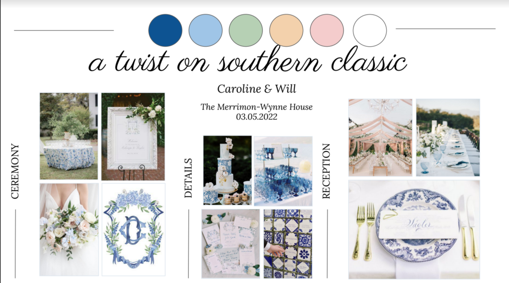
After talking with Caroline and Will, I was able to hear more about their love story (my favorite part). From there I began picking out a few image inspirations of my own for our design. Then, I created a Design Concept of my own to share with them! Each custom client fills out a Discovery Questionnaire that really lets me get clarity on what they love. Additionally, what is of equal importance is what they DON’T love.
Next, I craft a unique Design Concept that shares imagery for the direction of their stationery project. This typically includes a few patterns, design elements like monograms, and font style ideas. I also pull together the actual materials I plan on using for their suite. These include a variety of envelope colors and styles and paper recommendations. At this point, my recommendations for their suite all fit within the budget and project scope we discussed at booking.
I also like to share some fun ways we could take it a step further should they want to! However, there is never any obligation or pressure to do so. Part of my artistic brain just never shuts off (there are pros and cons to this). Therefore, it’s normal for me to come up with a few new ideas for add-ons or accents during either the Design Concept phase or the actual designing and creating phase that follows. This might be a unique way to showcase your monogram or a fun material switcharoo that would better highlight their design choices. Once the Design Concept was approved with a few minor tweaks to the font selections, I began designing!
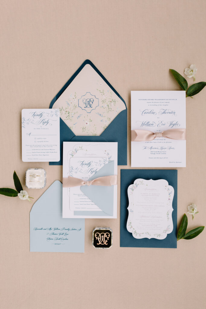
Painting and Designing their Blue and White Wedding Invitations
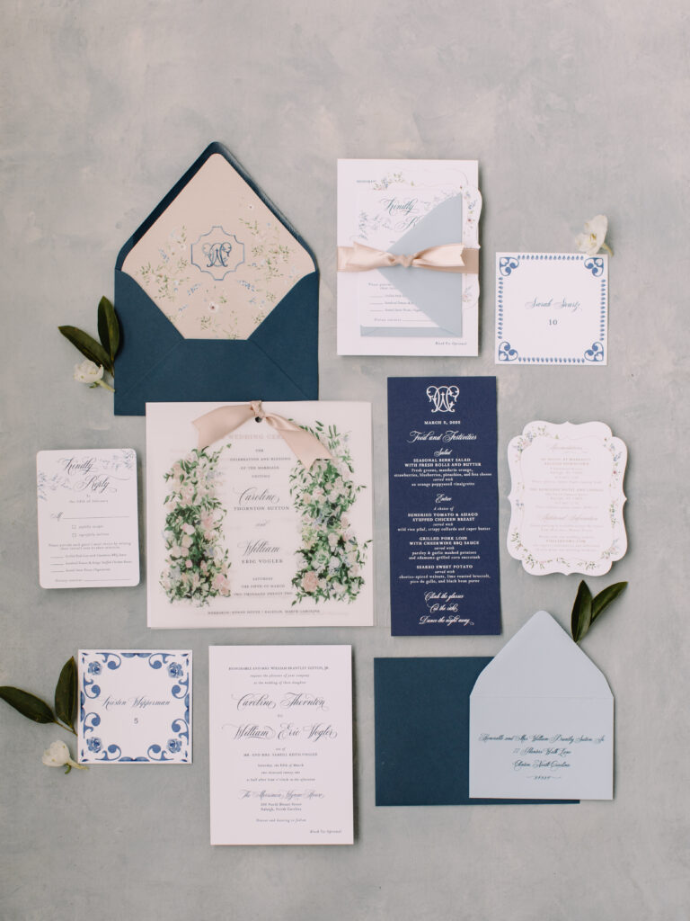
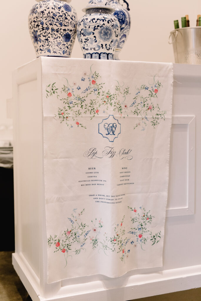
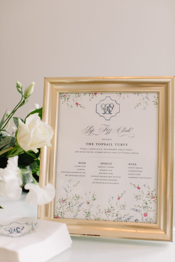
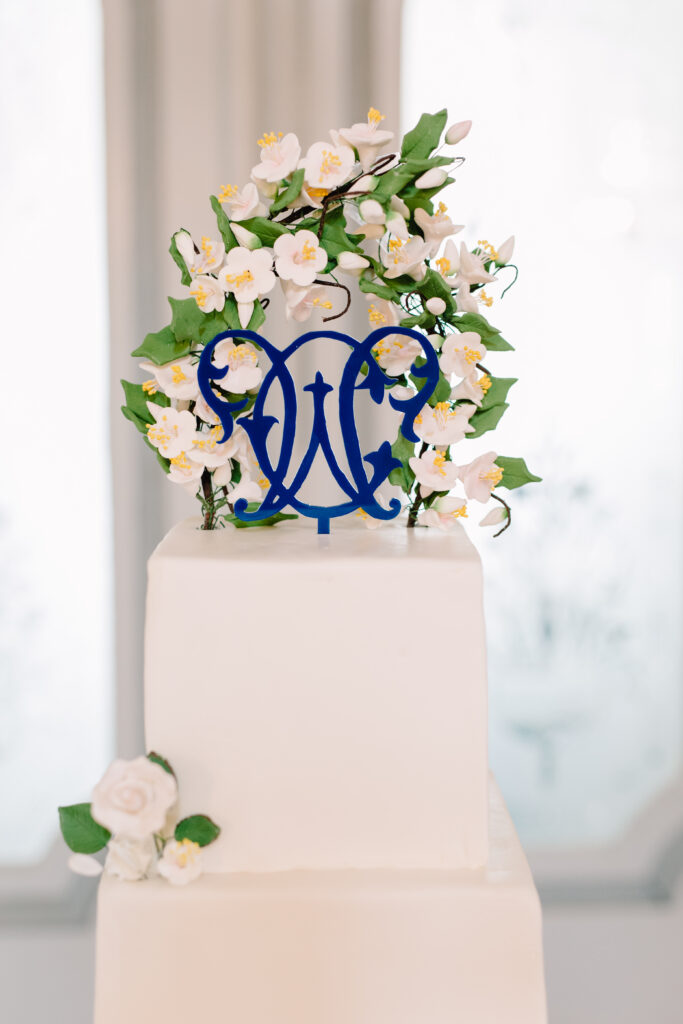
Their design focused on a blooming tree chinoiserie motif and reincorporating those same florals into a crest and other pieces. I painted each piece of their floral design based on inspiration from the flowers they were designing with Anna. We also chose a lovely crest style diecut for their Details Card. It reminded me so much of beautiful, traditional china and serving ware with a decorative border along the edges. Caroline decided that a champagne ribbon would be the perfect way to tie it all it up!
Creating a Cohesive Wedding Day Brand – Pulling Invitation Design Elements into their Wedding Day
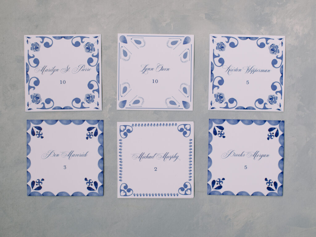
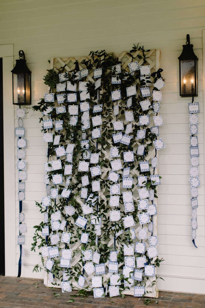
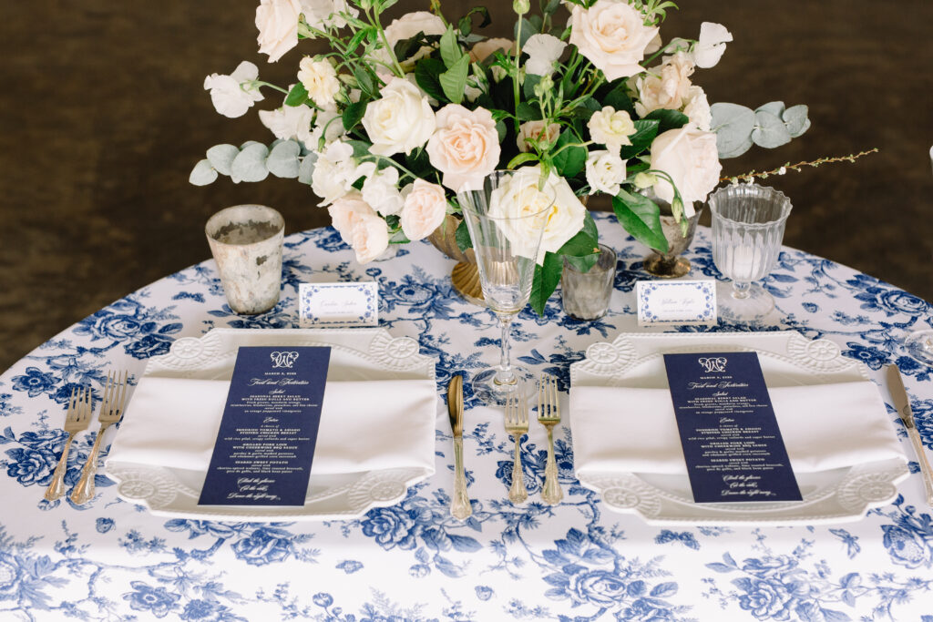
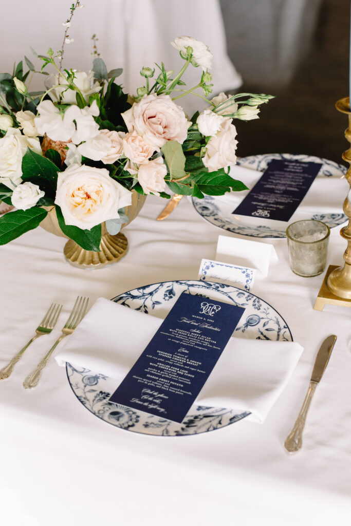
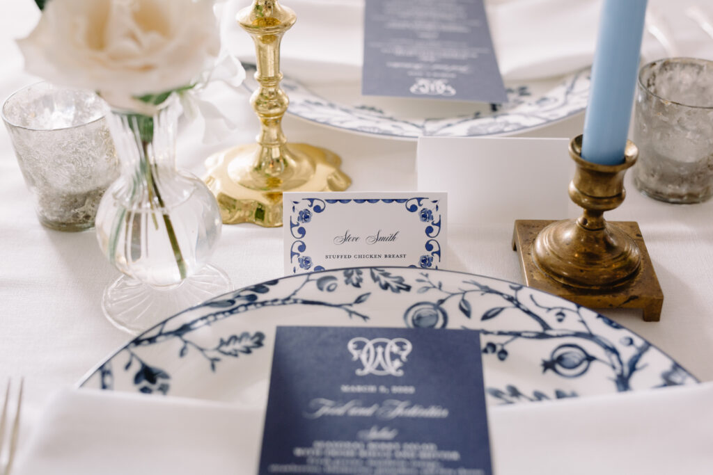
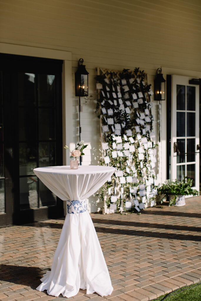
When thinking through Caroline and Will’s blue and white grandmillenial wedding inspiration for their day, we walked through place cards, menus, place settings and an epic seating chart installation! Not to mention, my favorite wedding programs to date. We also wanted the place cards and menus to tie in beautifully with their place settings. In order to accomplish this, I requested pictures of their place setting choices. I did this so I could be sure that what I designed would look perfect once paired with their plates and napkins.
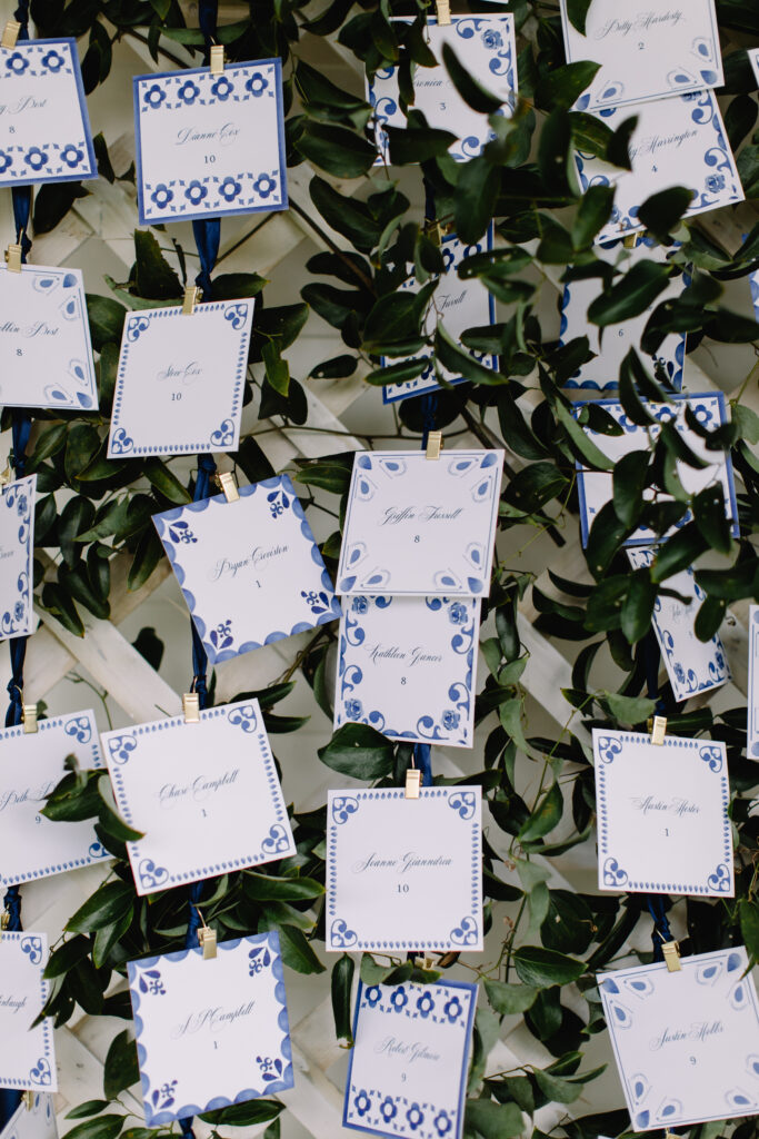
Caroline initially shared some inspiration for blue and white tiles as place cards. However, after a session of trying to source some to use, we came up with a budget friendly solution. I had the idea to recreate the look of the tiles with paper! We decided to do a double thick 4×4 square with a unique handpainted blue and white motif and each guests name which would then be placed on a trellis surrounded with greenery for the perfect “in the garden” look!
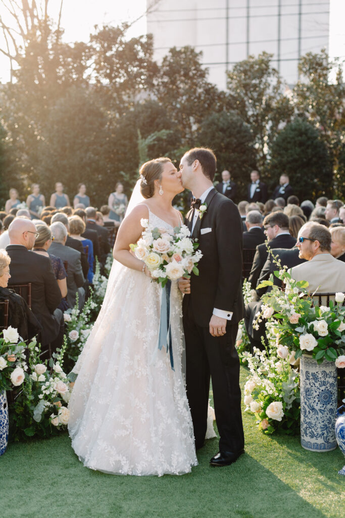
For the ceremony, Caroline was inspired by a recent suite I had done with a vellum jacket printed with a floral arch that was at the venue. She was hopeful we could recreate something similar with the floral arch installation Meristem would be creating for them to say “I Do” in front of! Naturally, I was thrilled – I love working with other vendors to find out how something will look, and create a painting of it in advance. I spent time handpainting a floral arch that would be printed on a vellum overlay and then tied on with the same coordinating ribbon from their wedding suite.
So, without further ado, are you ready to see how everything came together? Scroll down to see the amazing images captured by JP Pratt!
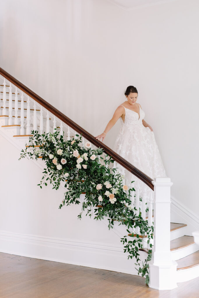
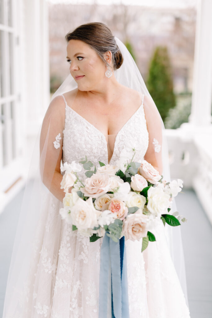
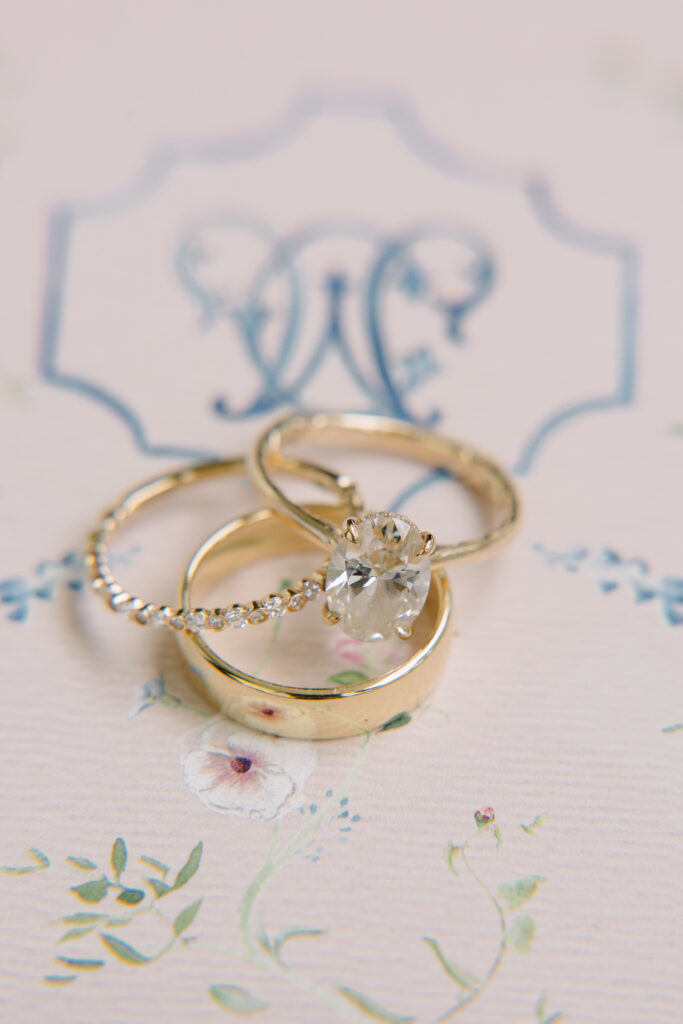
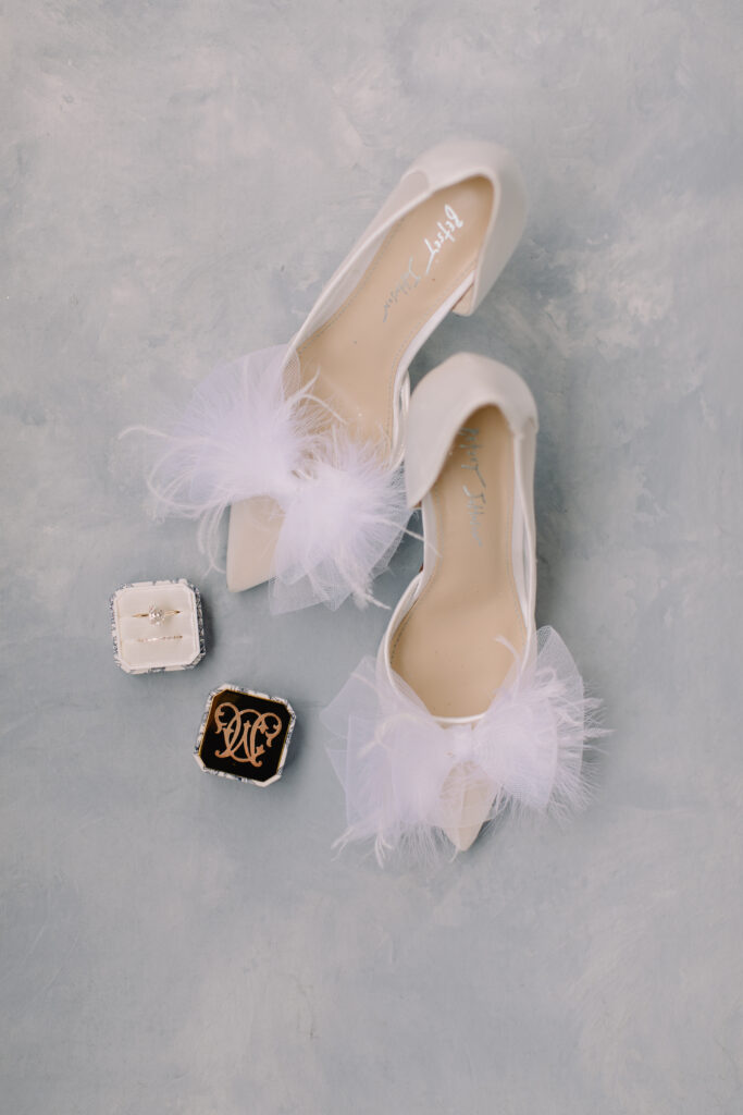
I hope you enjoyed learning a bit about my design process, as well as swooned over these photos as much as I did when I first saw them! Also, if after reading this post any of this wedding stationery lingo was confusing, be sure to check out this post which unpacks all of the ins and outs of wedding stationery. I also have another freebie for you – here is access to a wedding paper timeline guide to assist you in your planning.
Caroline and Will, if you’re reading this – you were an absolute DELIGHT and your wedding is not one I will soon forget! I wish you all the best in your marriage and journey together as husband and wife!
Vendor Love:
Venue – Merrimon Wynne
Planner – C & D Collective
Photographer – JP Pratt Photography
Videographer – John Ryan Films
Caterer – Rocky Top Catering
Rentals – CE Rental
Officiant – Dr. Ed Gunter
Florist – Meristem Floral
Ceremony Music – Magnolia String Quartet
Band – The Night Years (East Coast Entertainment)
Photobooth – Zim Zoom
Hair & Makeup – Tease and Blush
Cake – Sugar Euphoria
Stationery – Ya girl
