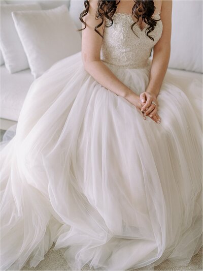
Ever wonder what it looks like behind the scenes for custom stationery, wedding invitations, and day-of goods? Like, how do we really pull apart a color palette, decide what goes where, how to style the day’s look, share a couple’s personality, all while making it cohesive and beautiful? Today, I’m pulling back the curtain on what that looks like! Let me introduce you to Kirsten and Frank. They are an incredible couple who tied the knot at The Carolina Inn in June. It was a Chapel Hill wedding celebration I will never forget!
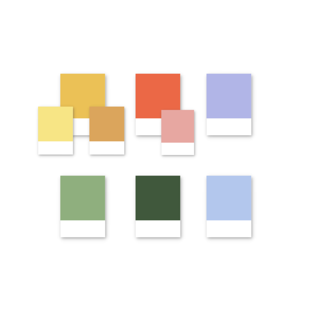
Frank and Kirsten were a delight to work with. From the moment I opened the Vision Board Anthem House designed and sent over, I knew we had a magical celebration in the making. They did not shy away from colors, especially brights, but with muted pastels and touches of neutral underpinnings as well. A little piece of every part of the color wheel made its way into their palette! I was so excited to translate that modern, fun color palette into something that was just as energetic, yet refined and traditional for their southern soiree as well.
The perfect Chapel Hill Wedding: First, let’s decide on your colors!
Kirsten and Frank met in college, on the beautiful grounds of UNC. Although they no longer call NC home, they couldn’t imagine a better place to say “I do” than under a Carolina blue sky. That Carolina blue, showing up in shades of periwinkle, paired with beautiful matcha green shades, pops of coral and subdued peach, plus a hefty does of lavender and Lilac next to goldenrod yellows and buttercup shades, it was a summer fete’s dream color board.
The colors of your wedding are integral when it comes to designing wedding stationery and day-of goods. As you can imagine, different palettes evoke different emotions and energies. How colors show up in your paper goods and signage is dictated largely by the setting you’ll be in, the vibe you’re trying to create, and the feelings you have about how to use color. By working with a stationer, we can pull out what your favorite shades are (if you have a lot). If this feels overwhelming, I can help you put together a palette that perfectly reflects what you can’t quite articulate.
Next up, identify your vibe.
Color dictates a lot of the wedding vibe, but the way you present those colors dictates even more. Are you feeling something minimal and modern, where typography packs a punch? Or are you leaning toward a more traditional and timeless vibe, with classic serif fonts and formal script accents? Maybe you want small borders of color, or full floral artwork explosions. Again, the way the colors are used in a given palette makes all the difference.
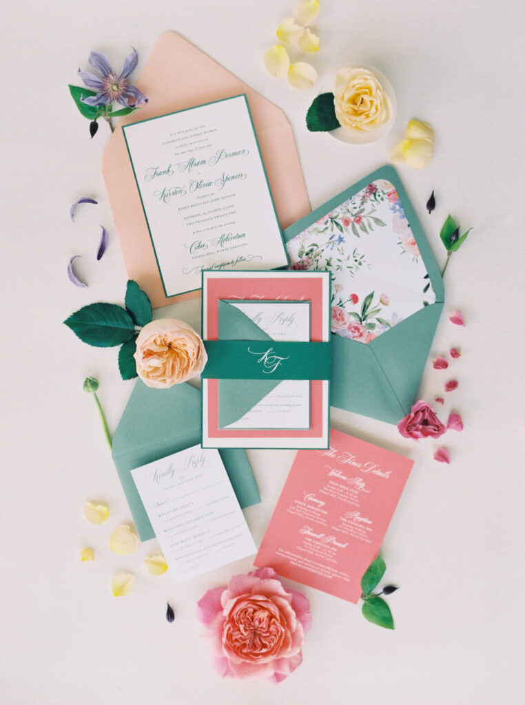
For instance, Frank and Kirsten had some beautiful Save the Dates made months earlier. The focus was on coral and green shades (which are perfect complimentary pairs) in a modern presentation. But since their overall palette contained many beautiful complimentary pairs, I decided to create a few different variations and colorways for them to choose from for their invitation suite. I knew they wanted to keep it traditional, but still have fun with color. Take a look at some of the options we created for them to choose from. Which is your favorite?
A few color options:
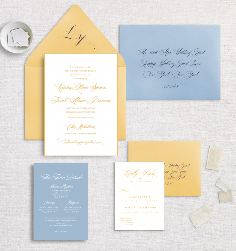
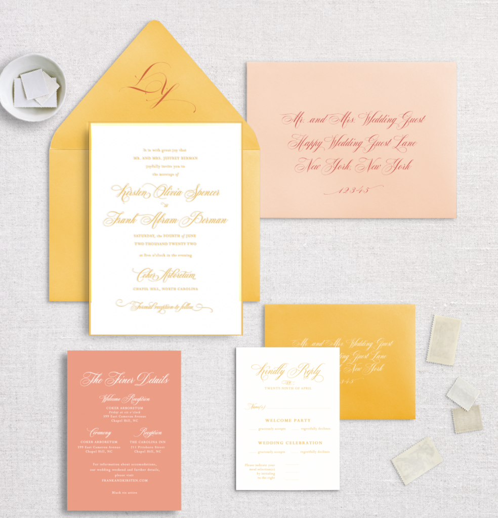
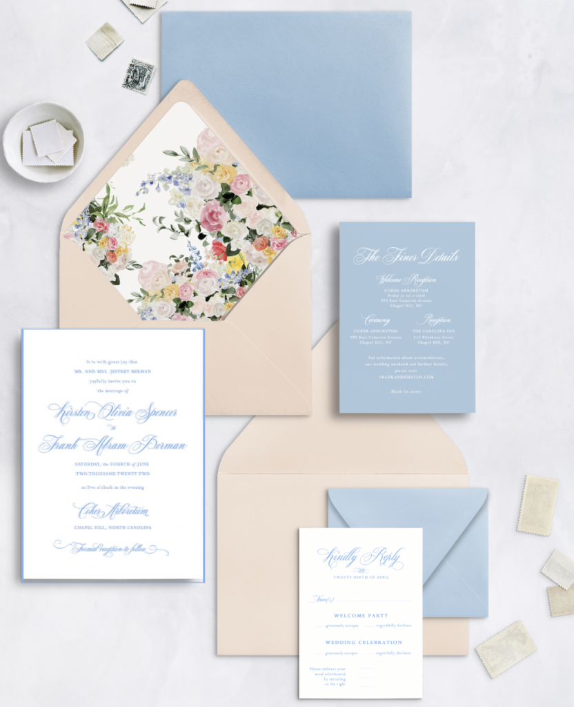
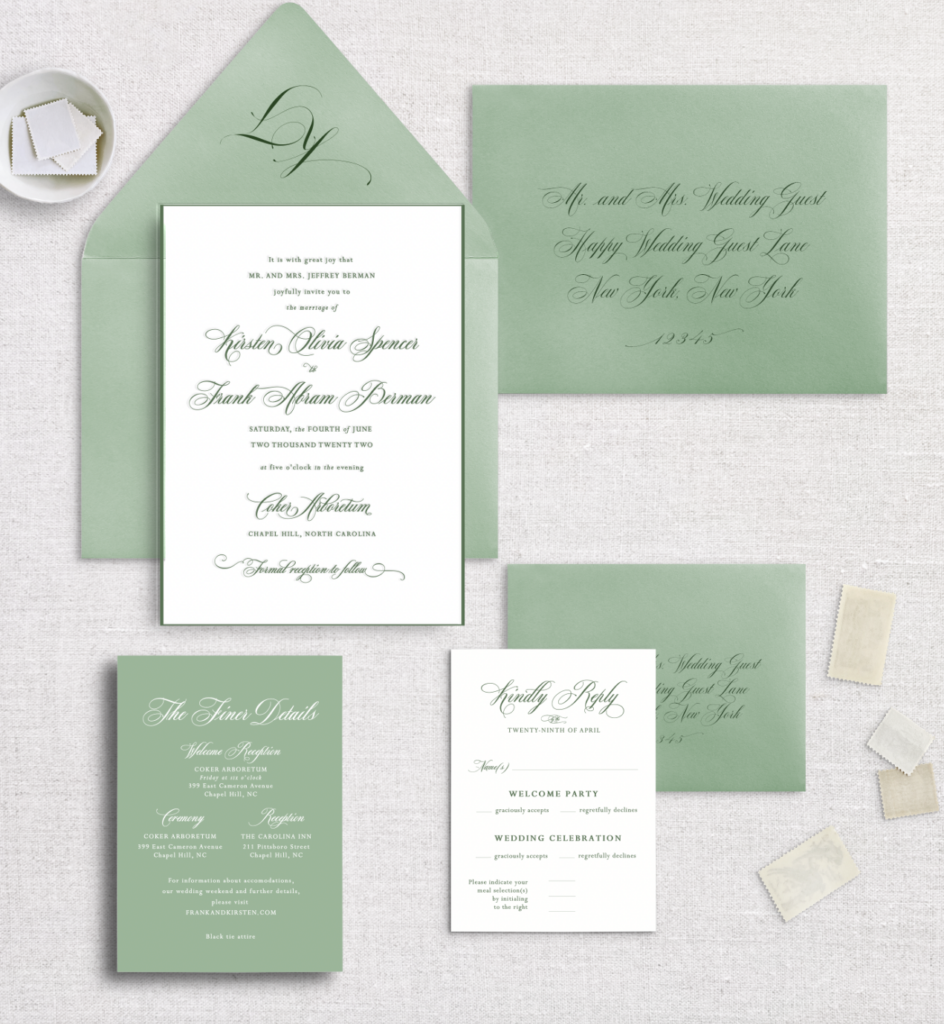
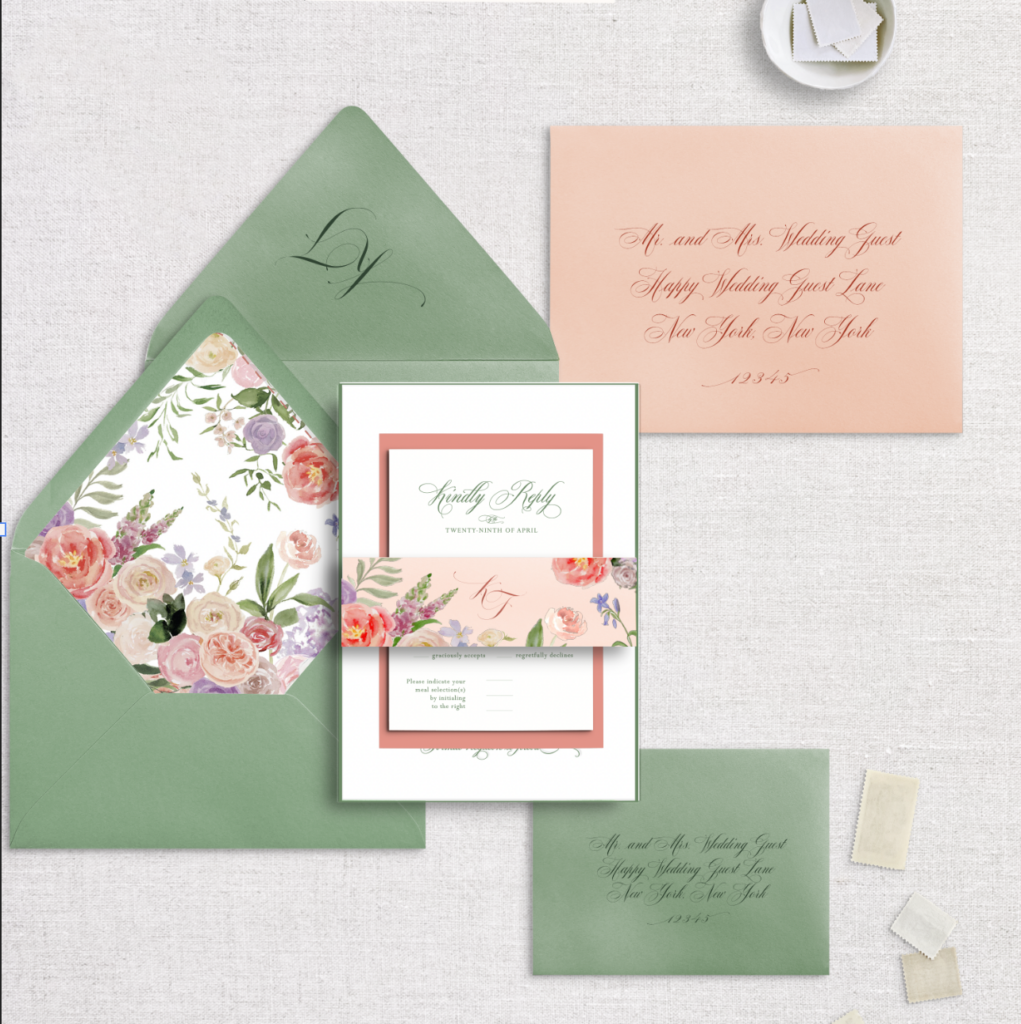
The coral and green-focused colorway was a perfect nod back to their save the dates. We let each piece of the suite have it’s own “main” color and focus. I hand painted the florals that they were envisioning while coordinating with Meristem Floral. Next, I arranged them into a lovely envelope liner that could incorporate all those other fun shades from their palette without making things too busy or overwhelming.
How do you think it all came together when considering the color palette? Timeless and traditional, but still very fun, right? The letterpress finish for the main A7 invitation was *chefs kiss*!
Bringing It Into the Wedding Day
For the their Chapel Hill wedding celebration, we kept the font and color choices consistent from their invitation suite. I pulled design elements from their floral envelope liner into a lot of their signage. Since wedding flowers are such an impactful and beautiful part of a wedding, I love highlighting them wherever I can. Continue reading and you’ll certainly see evidence of that!
Custom Watercolor Wedding Ceremony Map: Cooling off in Coker Arboretum
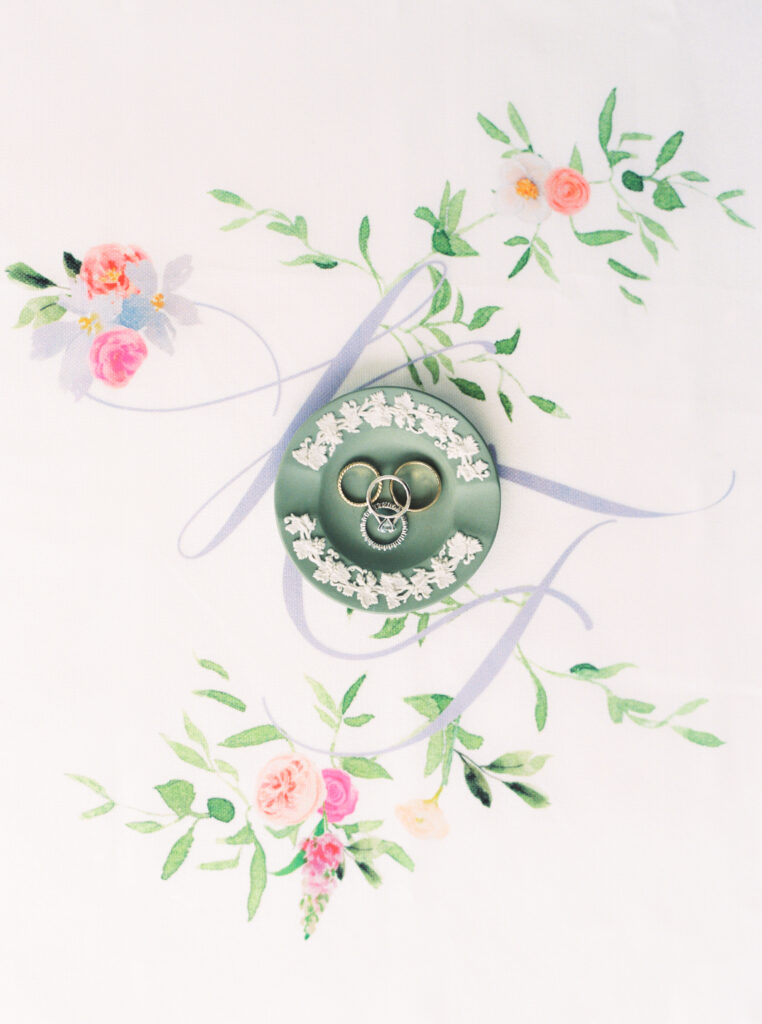
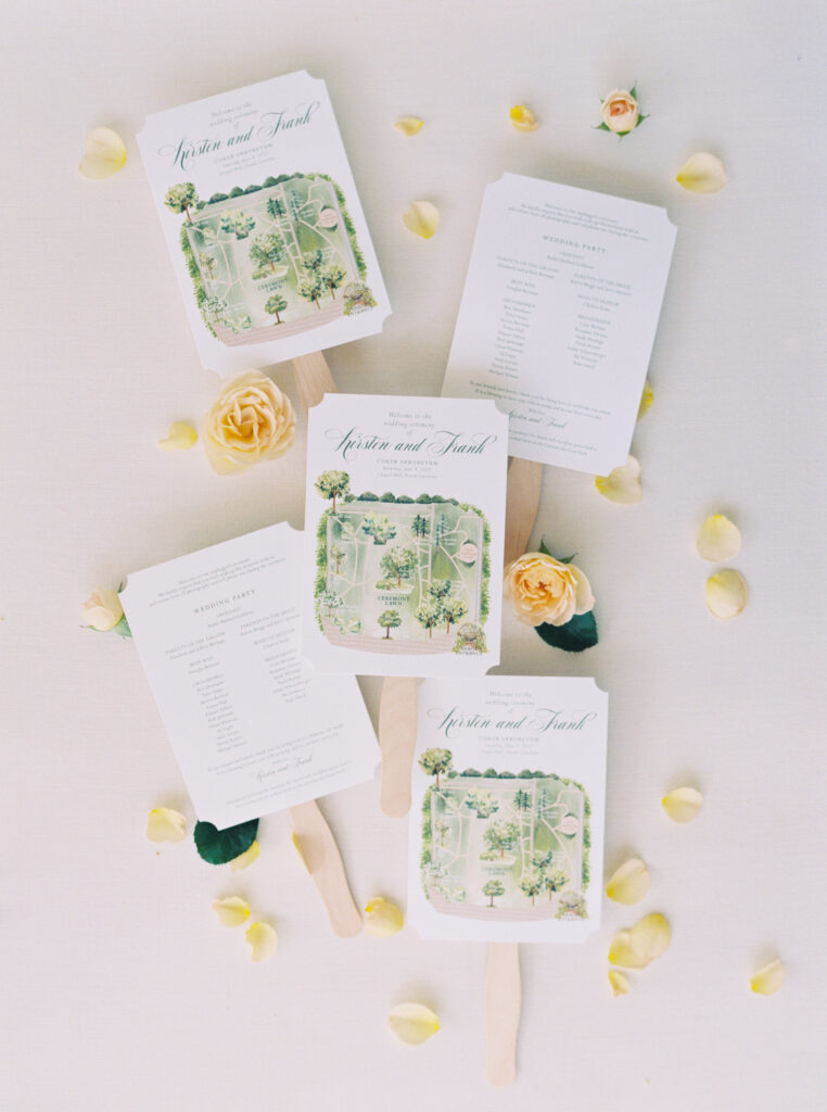
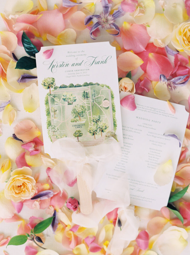
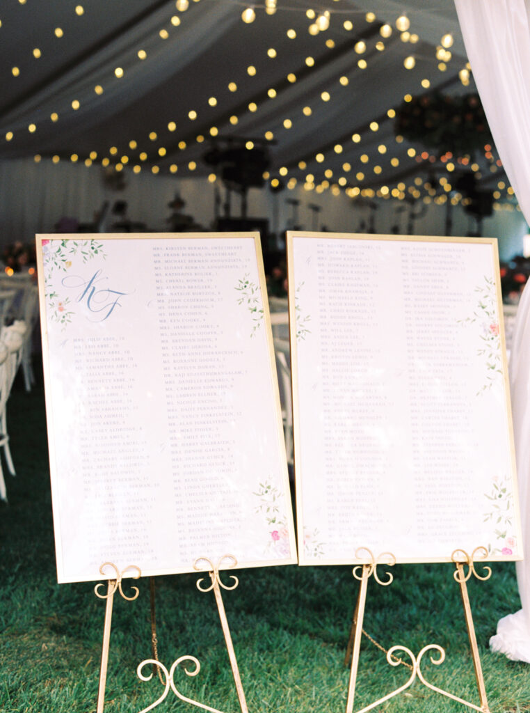
I incorporated their custom monogram, made from the main script font that was showcased on their main invitation, into their seating charts and welcome cards. Meanwhile, their thoughtful program fans to cool guests for their Coker Arboretum ceremony showcased a handpainted map of the arboretum. It highlighted the various iconic trees and landmarks throughout the gorgeous garden, such a special touch!
Kirsten and Frank were so thoughtful in every detail they chose. My opinion is that wedding day stationery should make your guests comfortable and give them the very best experience. What better way to do this than with a custom map to guide them to the ceremony location?
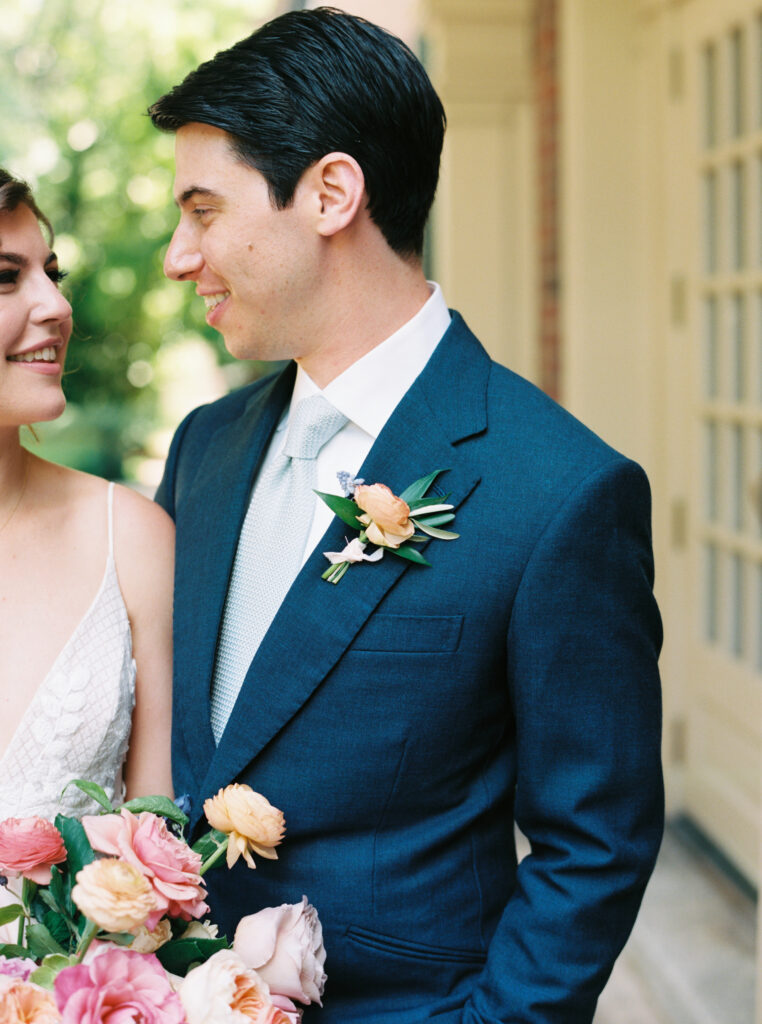
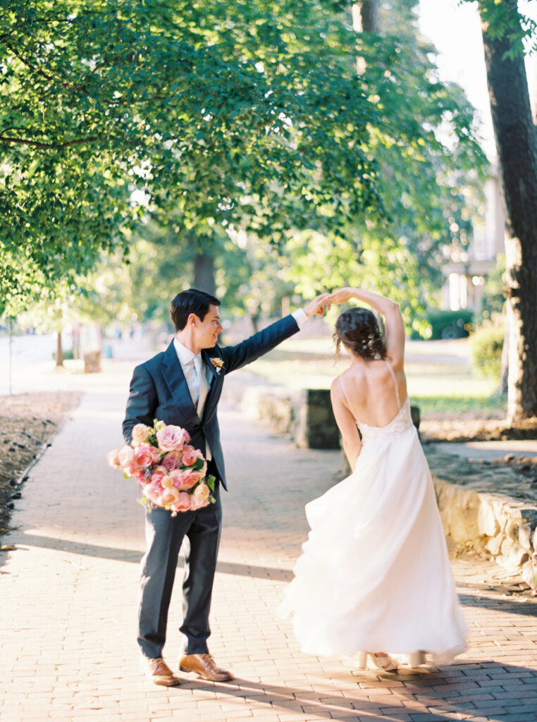
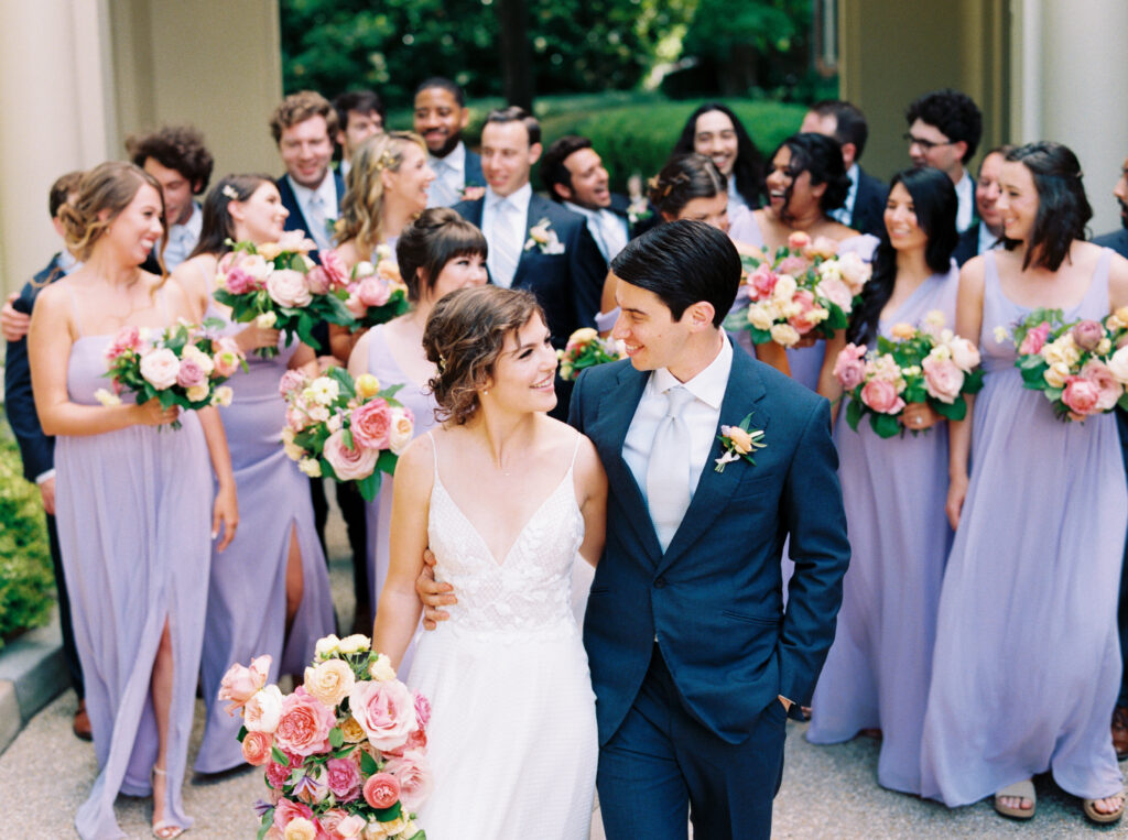
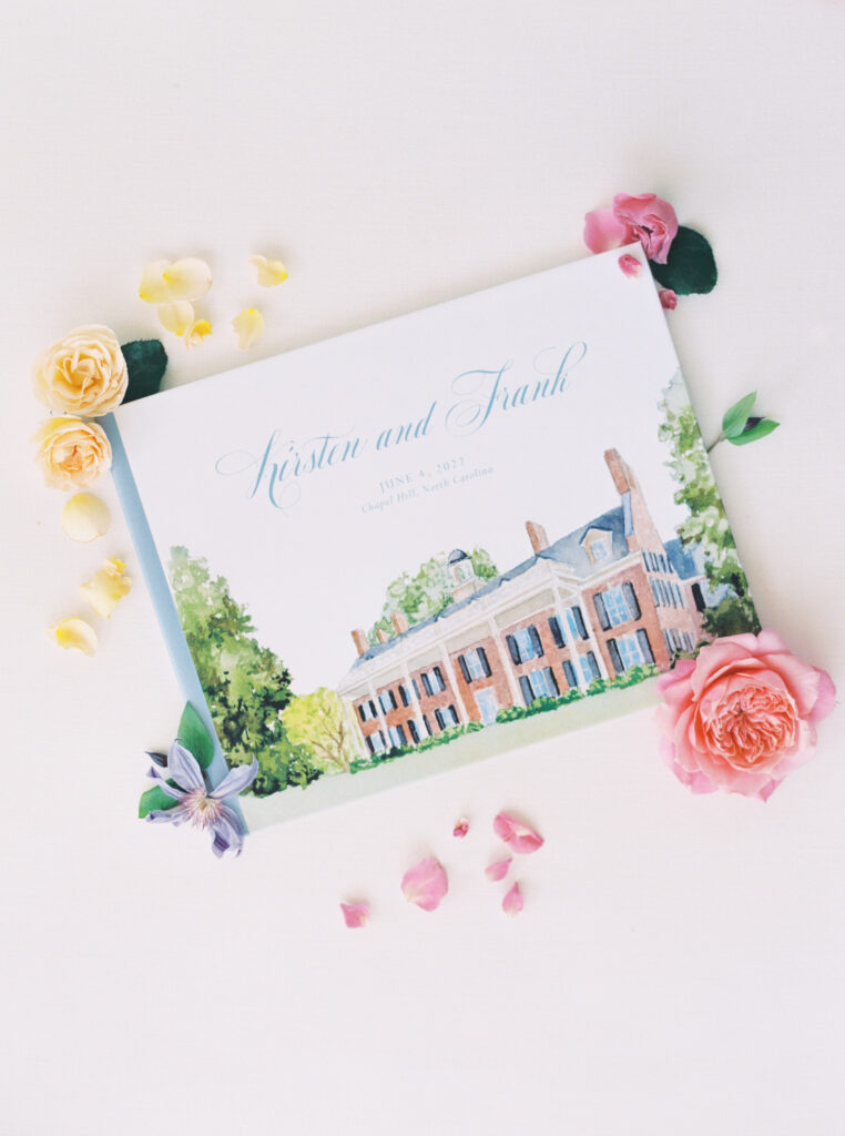
Their linens were a beautiful shade called Mystery Orchid from CE Rentals. As such, we pulled in that shade for a lot of their signage and paper goods. Not to mention, it popping up in the bridal party attire! Below you can see it in the seating chart signage. And don’t miss that venue illustration guestbook, too! The Carolina Inn really shines in this magical Chapel Hill wedding
Signature Drink Illustrations and a Fabulous Bar
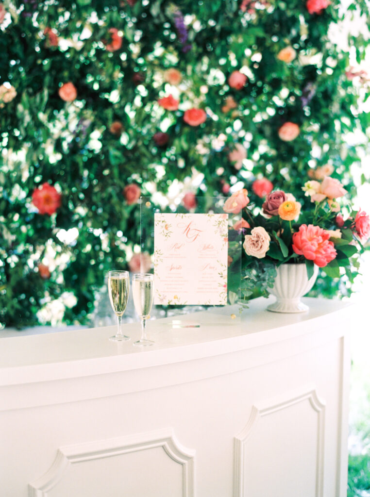
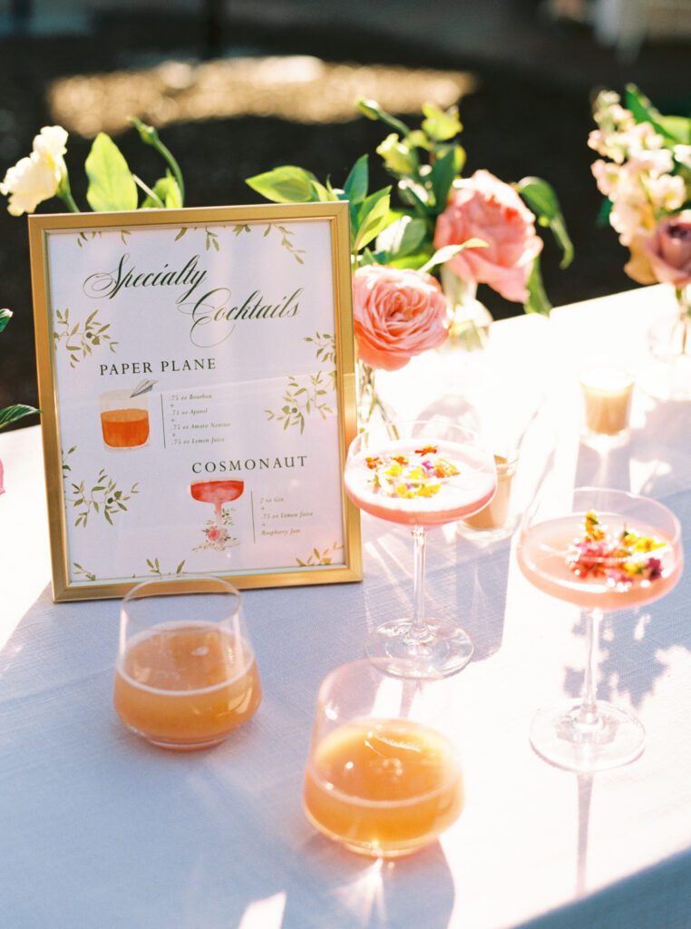
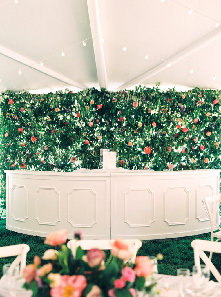
And can wet take a minute to talk about this bar?! Kirsten and Frank had two favorite cocktails recreated for their guests. To add some flair, I handpainted what they would look like for a fun signature drink sign. This one was printed on a luxe stock and displayed in a gold tabletop display frame. Side note: be sure to ask about my rental inventory if you’re a custom client, there’s lots of fun things you can borrow to display your pretty pieces! For the main bar areas, their full bar menus were displayed in acrylic frames with brass standoffs keeping the look elevated and clean, but fun!
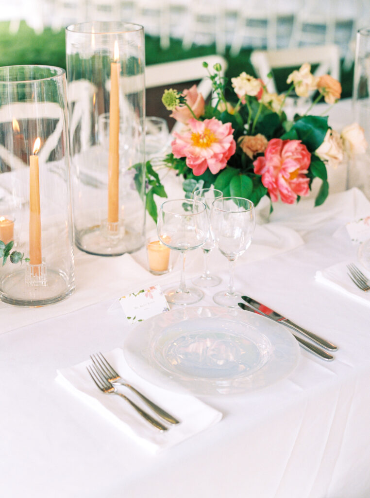
By working with their incredible planning team, Anthem House, I had a leg up on what their table settings were going to look like. They would have a clean white look with silver cutlery, so I added a bit of color for the placecards. As a nod to the incredible table arrangements by Meristem Floral, I painted the borders to compliment the centerpieces. The handpainted watercolor florals also made an appearance around the table numbers. See the acrylic blocks they’re displayed in? These are also a part of my extensive inventory I offer to my custom clients.
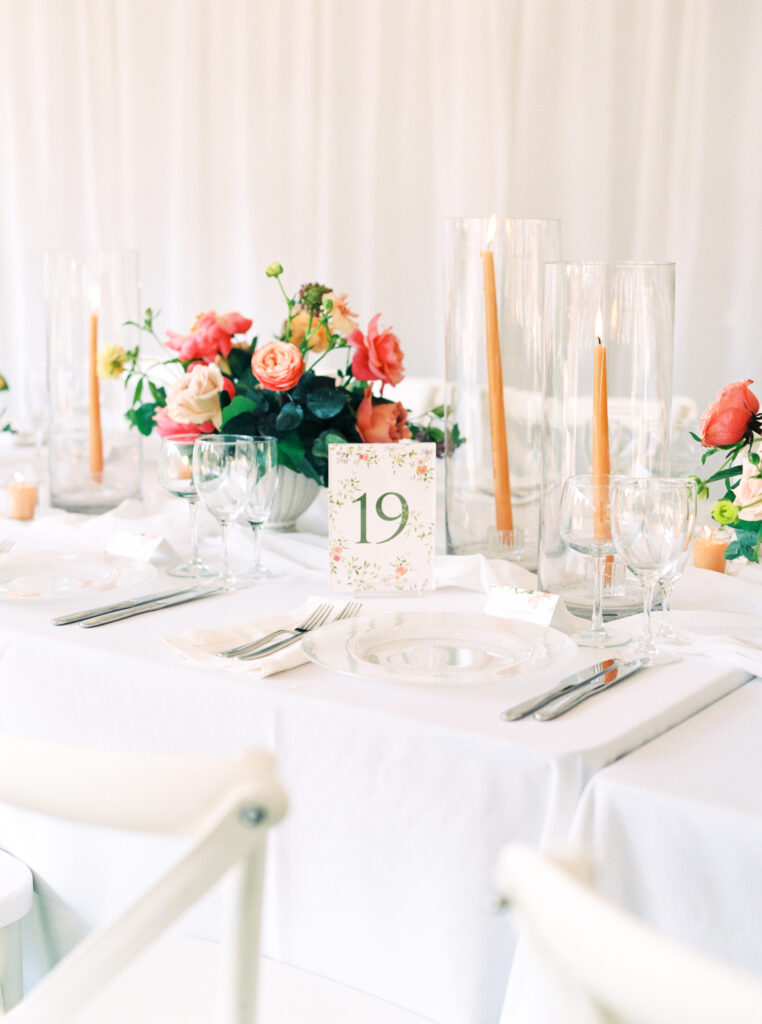
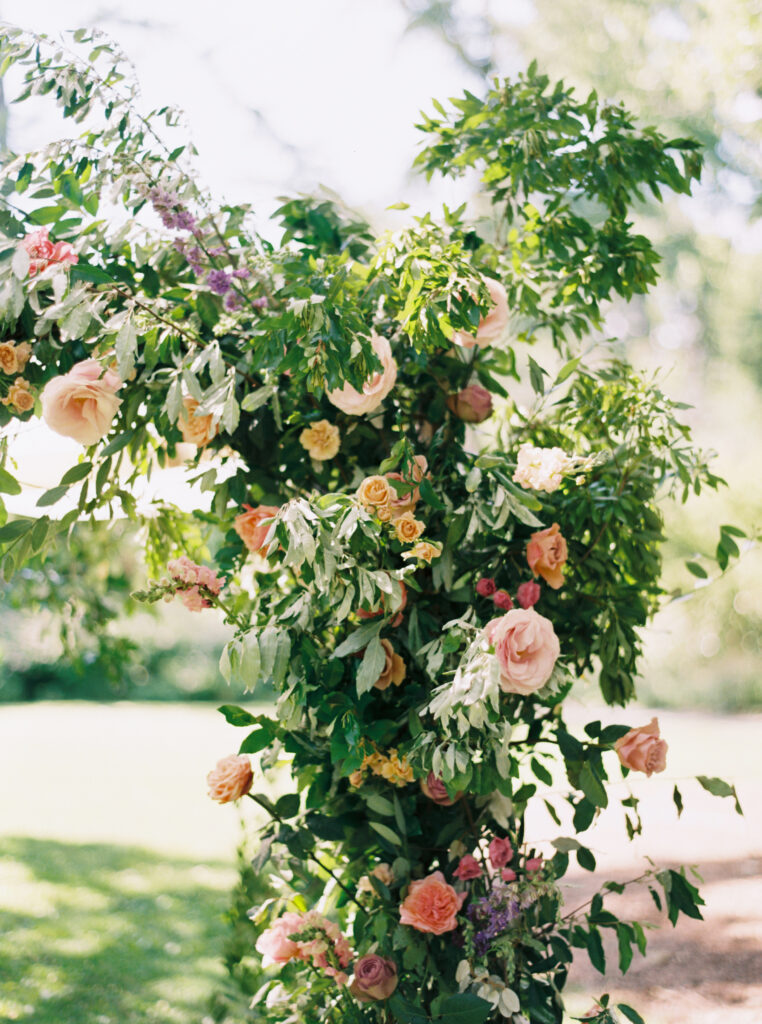
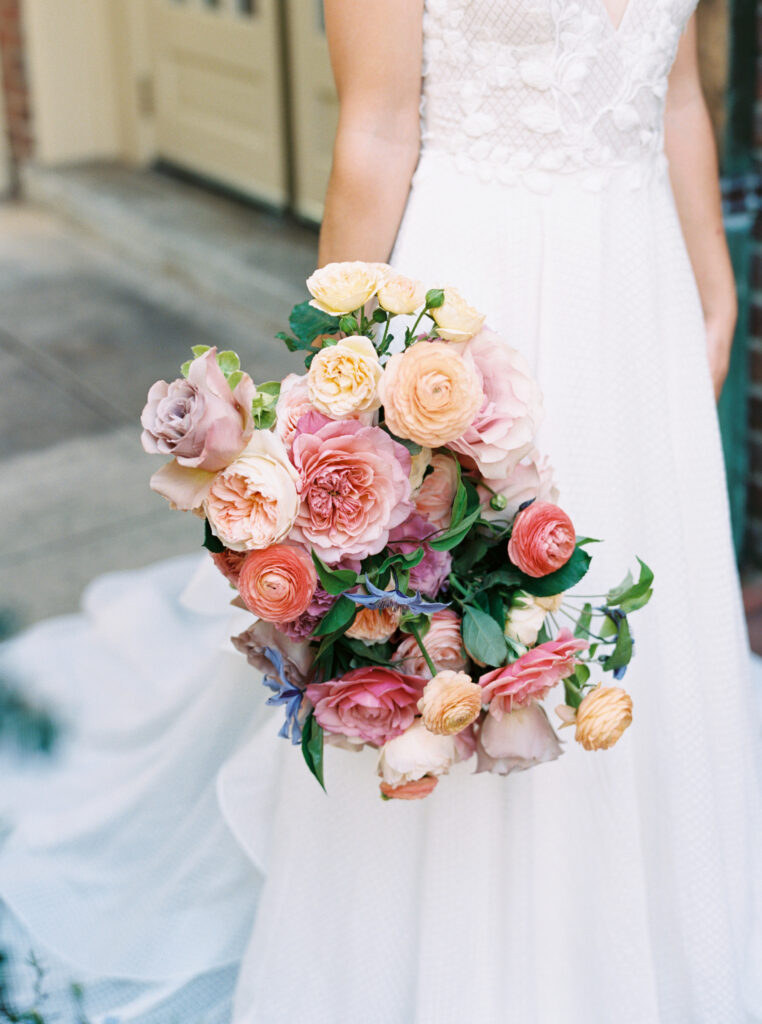
Let’s hear it one more time for how the flowers perfected this amazing wedding! Meristem Floral is a genius and true artist when it comes to wedding flowers. Additionally, her genuine kindness and love shines through her online presence as well as her in-person presence, too! The things she creates for her clients are top notch. If you’re not already, be sure you’re following her on Instagram (@meristemfloral). She often times gives details on how you can pick up remaining flowers after an event. Now you can find out where to grab the goods on Chapel Hill wedding weekends!
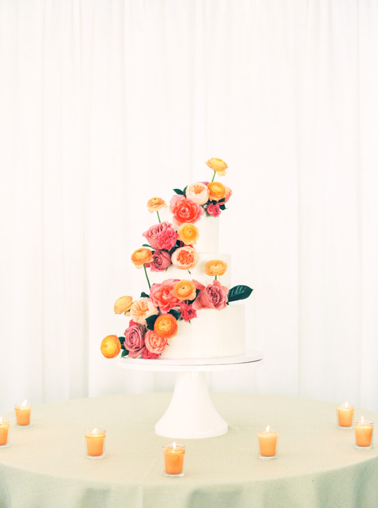
And can you believe this bright and beautiful wedding cake crafted by Sugar Euphoria? Those ranunculus from a distance look like a true pop of citrus. However, when you look closely, you see the unbelievable delicate petals and all the romantic vibes the votive candles highlight. I adore it!
Kirsten and Frank, it was an absolute delight. (And every vendor who played a part – the same goes to you!)
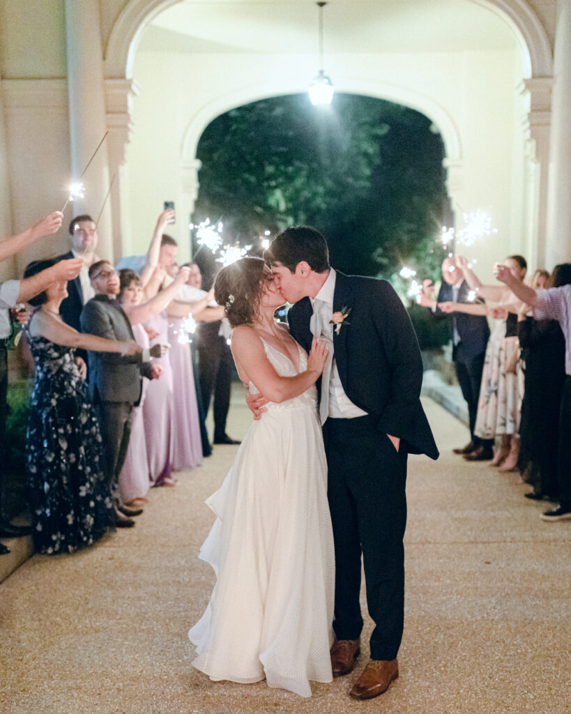
And of course, the most credit on earth due to the incredible Jillian Knight Photography team. These images are such an incredible treasure for Kirsten and Frank and their families! I’m always floored to receive copies of her incredible work.
If you’re getting married in North Carolina and are looking for help crafting the perfect wedding stationery, from invitations to day-of goods, I would love to help you! Please take a look at my Custom Stationery page, review the details there, and reach out when you are ready. Typically 6-9 months in advance is a good time to at least make contact with potential stationers. We do book up in advance and design calendars can fill quickly. I look forward to hearing from you!
Let’s hear it for the vendors:
Planning & Design: Anthem House | @anthem.house @becca_collective @whitney_collective
Photography: Jillian Knight Photography | @jillianknightphotography
Venue Carolina Inn: The Carolina Inn | @thecarolinainn
Videography: Heritage Weddings | @heritage.weddings
Floral Design: Meristem Floral | @meristemfloral
Rentals: CE Rental | @ce_rental_raleigh
Fine Art Paper Goods: Ashley Triggiano (that’s me!) | @artbyashleytriggiano
Live Entertainment: Big Swing and The Ballroom Blasters | @bigswingpartyband
Ceremony Sound: Bunn DJ | @bunndjco
Cake & Dessert: Sugar Euphoria | @sugareuphoria
String Instruments: Arioso Strings | @ariosostrings
Beauty: WINK Hair & Makeup | @winkhairandmakeup
